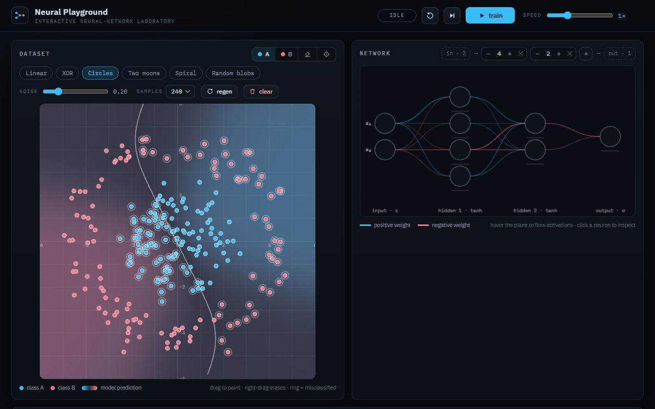
Neural network playground
Paint a 2D dataset, set up a small network, train it in the browser and watch the decision boundary move.
Prompt
Build a polished, interactive web application called **Neural Network Playground** that lets users visually create datasets, configure a neural network, train it from scratch, and watch how it learns in real time.

This is intended as a **one-shot coding benchmark**, so build the complete working application without asking follow-up questions. Make reasonable decisions yourself where details are unspecified. Do not leave placeholders, fake features, mocked training, or controls that do nothing.

Use **Vite + TypeScript**. Keep the project reasonably lightweight and prioritize correctness, interactivity, performance, and visual quality.

The central experience should be a large interactive **2D classification playground**.

Users should be able to create training data directly on a coordinate plane by clicking or dragging to paint points belonging to different classes. Include several useful preset datasets such as:

- linearly separable clusters
- XOR
- concentric circles
- two moons
- spiral
- noisy/random clusters

Allow clearing, regenerating, and editing the dataset.

Beside the dataset, provide a visual neural-network editor. Users should be able to configure:

- number of hidden layers
- neurons per hidden layer
- activation function
- learning rate
- batch size
- training speed
- optionally optimizer and regularization if implemented properly

The network visualization should clearly show the input neurons, hidden layers, output neurons, and connections between them. During training, visually represent changing weights and activations so the network does not remain a decorative static diagram.

Implement an **actual neural network and training process**. Do not fake training curves, epochs, predictions, decision boundaries, weights, or loss values.

The model should learn directly from the points drawn by the user.

The most important visualization is the **live decision boundary**.

Continuously evaluate the neural network across the 2D plane and render a smooth background showing which class the model predicts at every location. As training progresses, users should literally watch the decision boundary transform from randomness into a learned classification surface.

Overlay the real training samples on top of this surface.

Training controls should include:

- Start
- Pause
- Resume
- Reset network
- Single training step
- adjustable training speed

Display meaningful live metrics such as:

- epoch
- training loss
- accuracy
- samples
- elapsed training time

Add a live loss graph showing the training history.

Allow the user to click or move over an arbitrary location in the classification plane and inspect the network's prediction for that input. Ideally show class probabilities and allow the forward pass through the network to be inspected.

Include an optional **step-through mode** where one sample can be propagated through the network and the user can visually follow:

input
→ neuron activations
→ weighted connections
→ hidden layers
→ output prediction

If practical, make individual neurons selectable so the user can inspect their activation, bias, incoming weights, and output for the selected sample.

The application should make differences in architecture genuinely observable. For example, training XOR with no hidden layer should visibly fail while adding hidden neurons should allow the network to learn it.

Pay particular attention to numerical correctness. Training should remain stable across reasonable settings and should not produce NaN or Infinity values. Resetting should correctly initialize a genuinely new network. Pausing and changing training speed should work reliably.

The UI should feel like a professional scientific/educational visualization tool rather than a generic admin dashboard.

Prioritize the visualization itself. The dataset plane, decision boundary and neural-network representation should dominate the experience.

Use animations deliberately to communicate learning rather than merely decorate the interface. Changes in predictions, loss, activations and network weights should be visually understandable.

Make the interface fully responsive. Desktop should provide the richest experience, but the application must remain usable on tablets and mobile devices by intelligently rearranging the layout.

Include small explanations or tooltips where they help users understand what they are seeing, but avoid turning the application into a textbook.

Structure the code cleanly. Separate neural-network mathematics, training state, dataset generation, rendering, and UI logic rather than putting the entire application into one giant component.

Performance matters. Training and decision-boundary rendering should remain smooth with hundreds of samples and reasonably sized networks.

The final result should feel like a small interactive laboratory where someone can **experiment with neural networks and actually see learning happen**.

Before considering the task finished, verify that:

- drawing custom datasets works
- every dataset preset works
- the neural network actually learns
- architecture changes affect learning
- XOR demonstrates the need for hidden layers
- the decision boundary reflects the real network output
- loss and accuracy reflect actual training
- pause/resume/reset/step all work
- network weights and activations shown in the UI correspond to the real model
- controls are not decorative
- there are no obvious console errors
- the application works well at different screen sizes

Do not simplify the task into static diagrams or prerecorded animations. The simulation and learning process must be genuine.
Anthropic
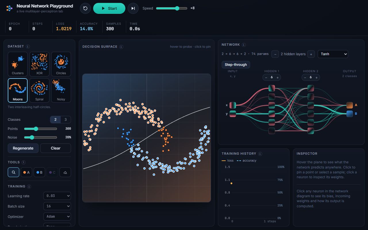
Great network view: every neuron is drawn as a little heatmap, and you can pin a point and watch it while the weights change. XOR and moons are solved in seconds. The spiral didn't budge with the default settings, though: it sat at 57% with a straight-line boundary, so the hardest preset needs manual tuning.
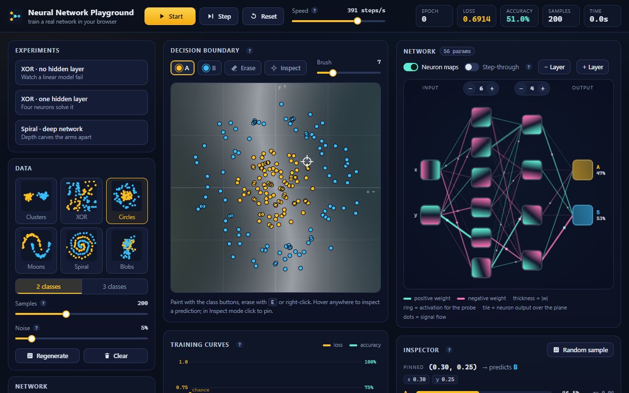
The one that understood the brief best. It comes with ready-made experiments like 'XOR – no hidden layer' to show a linear model failing, neuron heatmaps, and the fastest training here: the spiral hit 99.5% in about 12 seconds. The yellow, teal and pink palette is a bit loud, but this is the one I'd show someone first.
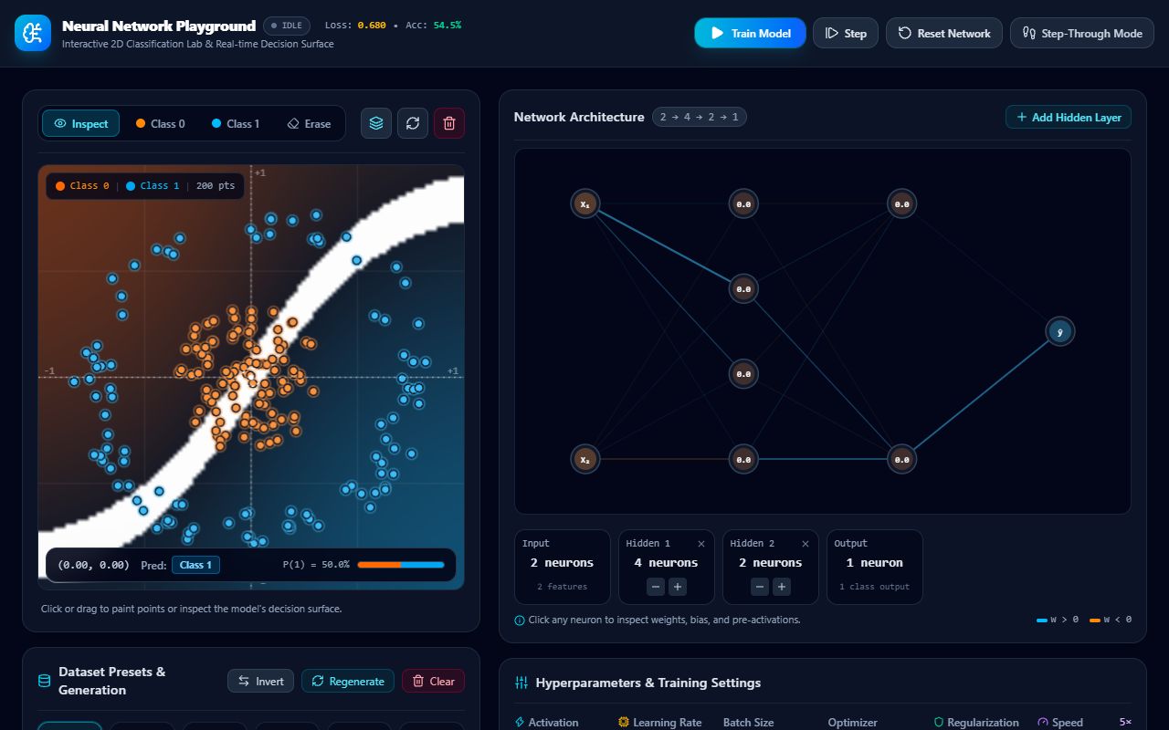
Looks like a full lab, but it's the weakest learner here. With the default network XOR got stuck at 75% and the spiral never moved off 50%, and the decision surface often shows up as a strange white band instead of a clear boundary. The big dashboard cards push the loss chart below the fold.
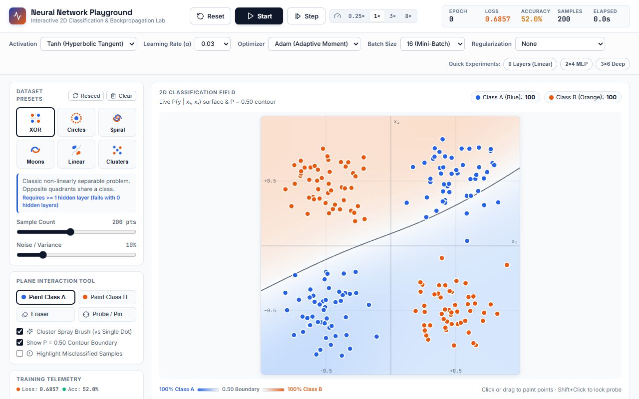
Learns everything I threw at it, fast: XOR, circles, and the spiral at 92% in about 12 seconds. The '0 Layers (Linear)' quick button is the perfect way to show why XOR needs a hidden layer. But it went light mode, the network diagram isn't on the first screen even though the brief wanted it front and centre, and on a phone you scroll past every setting before you reach the plane.
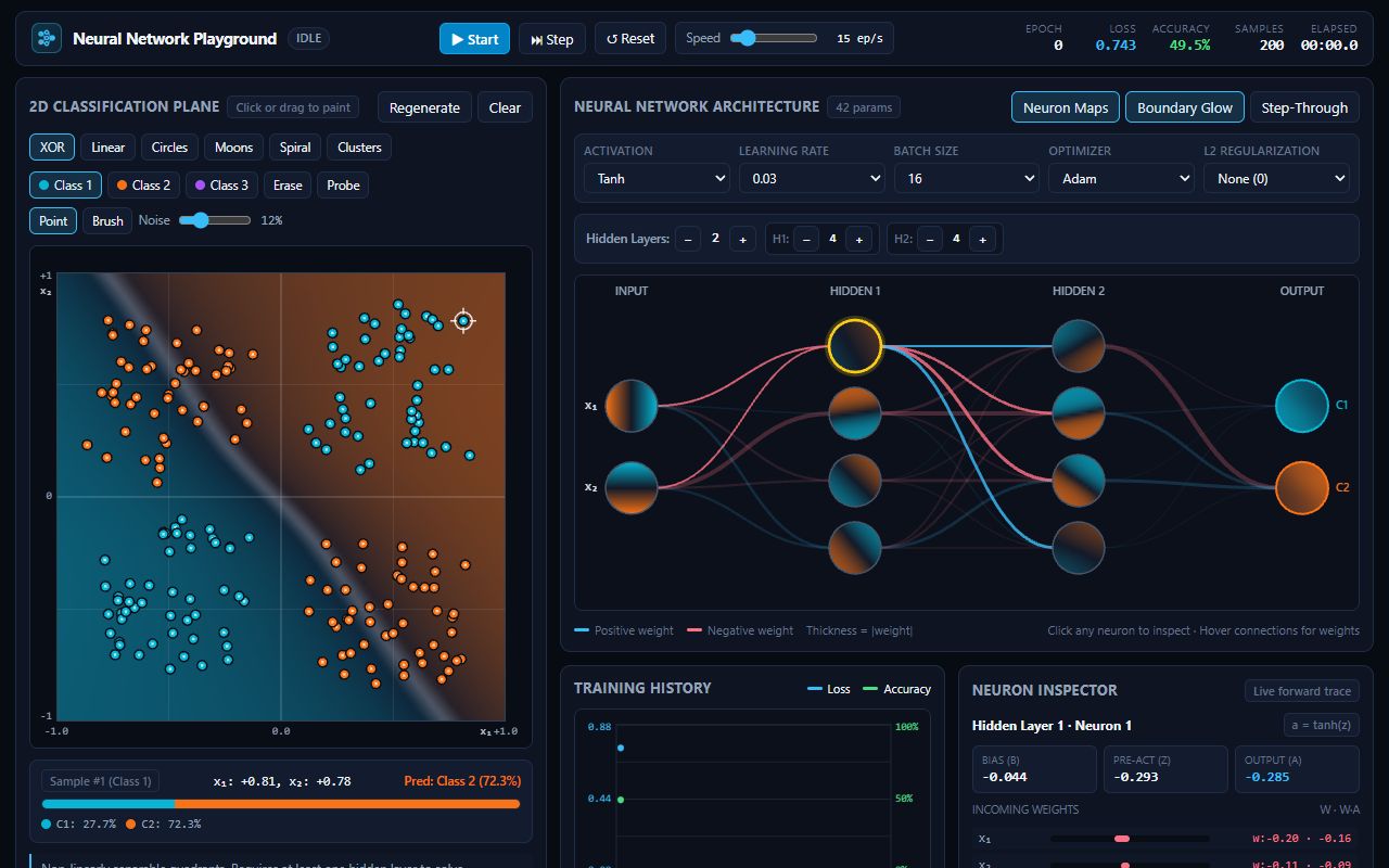
The densest app here and one of the best. Every neuron shows its own mini decision map, and there's a neuron inspector, a training history and step-through. It cracked XOR and the spiral (96%) in seconds. It's a lot to take in when you first open it, but none of it is fake.
OpenAI
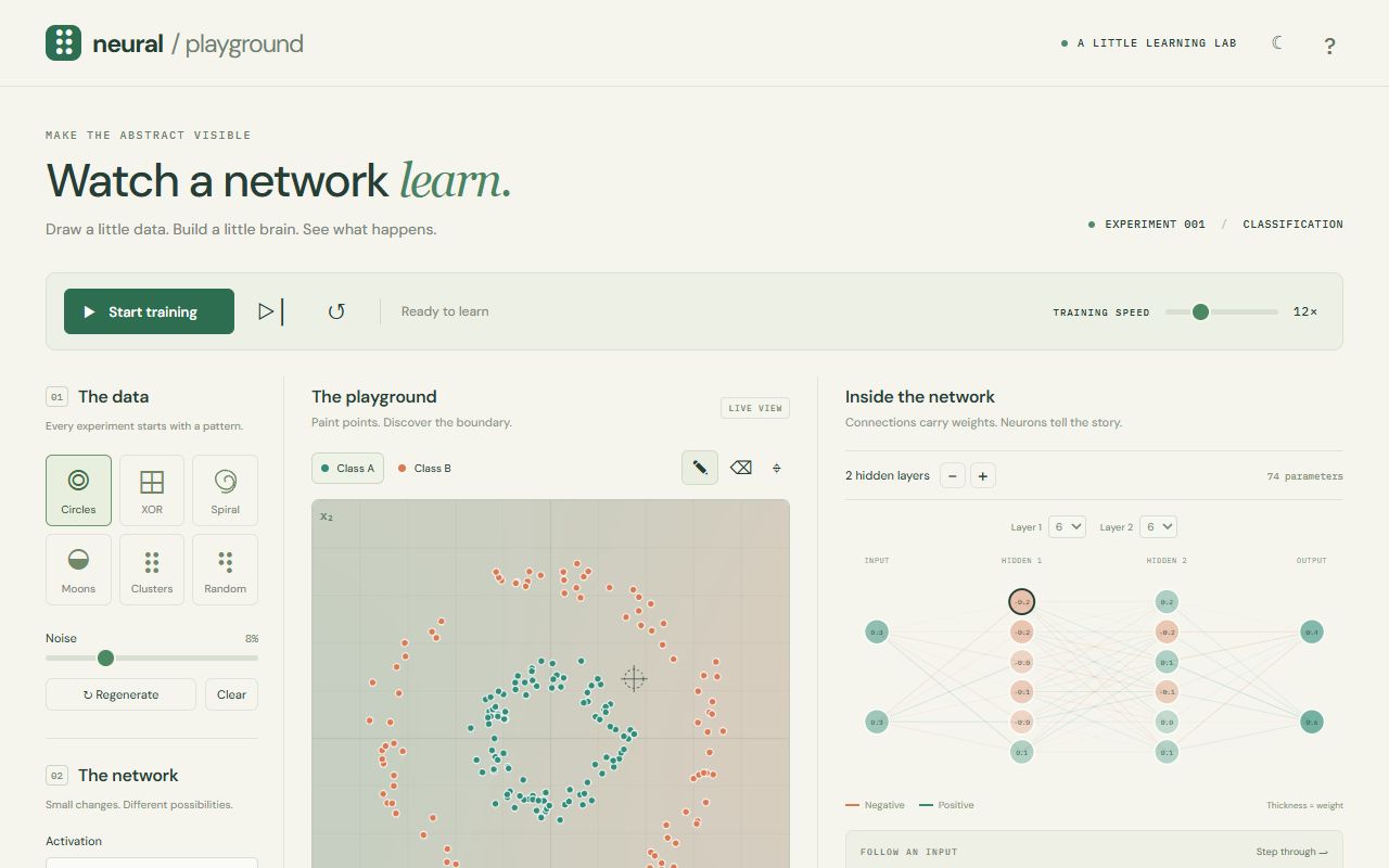
A warm, editorial light theme that feels like a good science book, and it learns well: circles, XOR and spiral done in seconds, with neurons lighting up as it trains. But the big 'Watch a network learn.' hero eats the top of the page, so the plane ends up smaller than it should be.
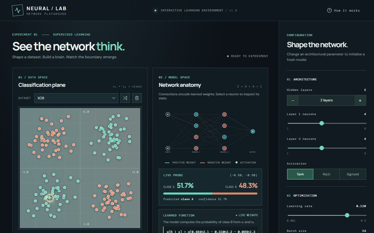
Showing the actual learned equation is a cool idea, and the dark teal look is nice. But training is slow, around 4 epochs a second, so XOR needs about 30 seconds and for a while it looks like nothing is happening. The page is also very long on a phone.
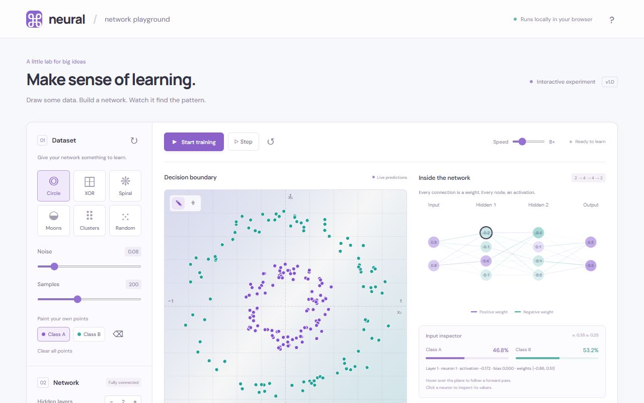
Light, friendly and clear, with a small input inspector under the network. Circles and XOR are learned quickly, but the spiral stalled around 64% with the defaults. Like Astra, the big headline up top takes space the plane could use.
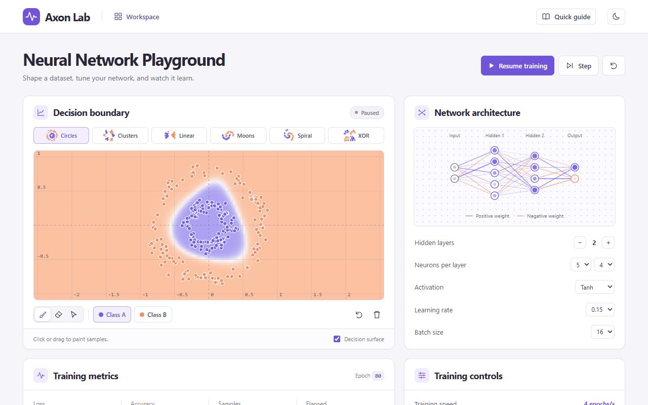
Polished, but it opens with the network already trained to epoch 80, so the circle is solved before you touch anything. That skips the exact moment the prompt cared about: the boundary going from random to learned. After that it works well (XOR solved, spiral at 90%), but the light SaaS-dashboard look is what the brief asked to avoid.
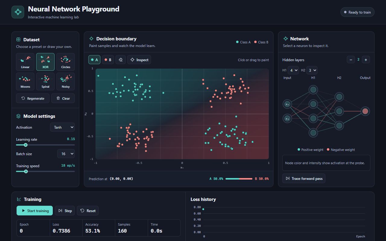
No gimmicks, it just works: clean dark layout, the plane comes first, a proper loss chart, and XOR and the spiral (95%) learned within seconds. Trace forward pass is there too. Not the most memorable design, but one of the most dependable.